There’s a grammar to the street that has nothing to do with words. It lives in the faded ochre of a rent-by-the-week hotel, the loud cyan of a corner store awning, the matte black of a bodega sign that’s been staring down the sun for thirty years. These aren’t accidents of paint selection. They’re utterances. The city speaks through its surfaces, and if you slow down enough to look—really look—you can read a neighborhood’s whole story in its color choices.
Most people treat urban color as decoration, a cosmetic afterthought slapped onto the hard facts of concrete and steel. That’s like saying tone of voice is an afterthought to language. The red of a fire hydrant isn’t decorative; it’s a command. The particular green of a park bench, repeated thousands of times across boroughs, is a municipal promise that this spot belongs to everyone. These colors form a shared vocabulary, understood without anyone ever teaching it.

Authority in Pigment
Walk through any major city and you’re navigating by color long before you read a street sign. The postal service blue—that specific, mid-tone shade—marks drop boxes with a quiet authority. It doesn’t shout. It simply states: this is where the system touches the street. Transit authorities understand this instinctively. The orange of a ticket machine, the yellow safety strip on a platform edge—these aren’t branding exercises. They’re functional speech, a visual language designed to be read at speed by commuters who have no bandwidth for words.
What gets me is how this institutional language bleeds into the vernacular. A laundromat owner in Queens paints her storefront the same white as the hospital down the block. She might not articulate why, but the choice communicates cleanliness, sterility, a promise that your clothes will emerge purified. The color borrows authority from the institution and repurposes it for commerce. It’s linguistic drift, happening in pigment instead of phonemes.
Territory and the Tag
Nowhere is color more explicitly a language than on a heavily tagged wall. A fresh piece in hot pink and electric blue isn’t just self-expression. It’s a territorial marker, a statement that says I was here, this is mine, this is now. And the buff—that sad, mismatched beige the city slaps over tags—is a statement too. It’s the institutional voice trying to shout down the individual, to reassert control. But the buff never quite matches the original brick or concrete. It leaves a scar, a visible silence where a voice was silenced. The next writer sees that scar and knows exactly where to speak again.
This back-and-forth is a conversation. The city says “order” in beige. The writer responds “presence” in neon. The property owner, caught in the middle, sometimes commissions a mural—a sanctioned burst of color that tries to translate the raw energy of the street into a language the city can accept. It rarely works. The sanctioned mural lacks the essential grammar of risk, the understanding that a statement gains power from its potential impermanence.

Commerce and the Chromatic Pitch
Retail color is a pitch, a shouted offer. The golden arches, the red and white of a sale sign, the deep green of a coffee chain signaling ethical comfort—these are the loudest voices on the block, backed by research budgets and focus groups. But the most interesting commercial color language happens at the margins, where the budget is small and the need to be seen is desperate.
Take the cell phone repair shop. Its signage is almost always a jarring combination of neon green and black, or electric blue and yellow. This isn’t a brand standard. It’s a survival tactic. The colors scream “technology, connectivity, fix it here” in a visual dialect understood across languages. A recent immigrant with limited English can spot that green and black from a block away and know exactly what’s on offer. The color is the message, more direct and universal than any text could be.
Food vendors operate on the same principle but with a different vocabulary. Warm tones dominate: the burnt orange of a taco truck, the sunflower yellow of a hot dog cart’s umbrella. These colors signal heat, flavor, a specific kind of informal abundance. A cart painted in cool blues and grays would be visually illegible, a sentence that makes no sense in the grammar of street food.
Residential Whispers and Shouts
Homes speak more quietly, but they still speak. A front door painted a deep, glossy red in a row of white and beige doors is a declaration of individuality. It says, “Someone different lives here.” The pastel pinks and mint greens of a gentrifying block are a more complex statement, a visual signal of investment and changing demographics that can read as renewal or erasure, depending on where you stand.
Window frames carry meaning too. In many older neighborhoods, the specific shade of green on a window frame—often a dark, almost black forest green—is a holdover from when that pigment was the cheapest and most durable available. It persists not because of poverty but because of a quiet, stubborn continuity. It’s the visual equivalent of a regional accent, maintained long after the economic conditions that created it have passed.
Decay as a Chromatic Process
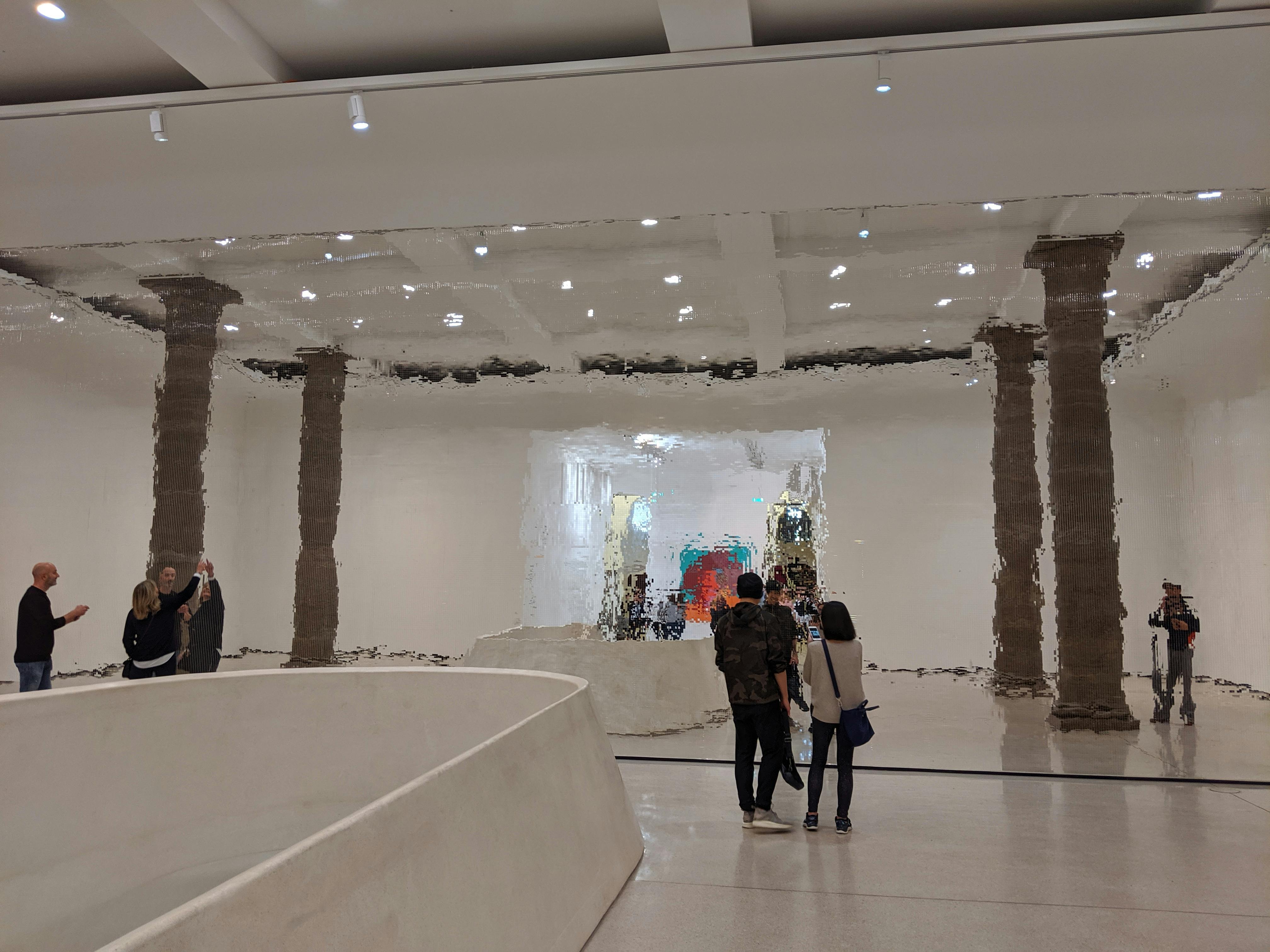
We tend to think of decay as the absence of color, a fading to gray. But real urban decay is surprisingly colorful. Rust is a vivid, complex orange. Water damage creates blooms of yellow and brown on plaster, like abstract expressionist paintings. Copper oxidizes to a distinctive green that architects have been deliberately imitating for centuries. Mold and moss introduce their own palette of deep greens and blacks.
These colors of entropy aren’t random. They follow predictable chemical and biological processes, and they tell a story about time, neglect, and the relentless pressure of the elements. A building that’s uniformly gray has been recently painted. A building with a water stain spreading from a clogged gutter is telling you, in streaks of ochre and umber, exactly where the maintenance failed. The color is a diagnostic tool, a visible symptom of a structural problem.
Learning to Listen
Reading color as a language requires a shift in attention. It means treating a subway station’s tile work not as a backdrop but as a text. The specific white chosen for the walls, the accent color on the columns, the way the light interacts with the glossy surfaces—all of it is communicating. It tells you whether you’re in a station built in the 1920s or renovated in the 1990s. It tells you whether the transit authority is projecting an image of cleanliness, efficiency, or simply trying to make a grim underground space feel less oppressive.
This literacy isn’t academic. It’s practical, lived, and available to anyone who walks through the city with their eyes open. Next time you’re on your block, try to see it as a page. What’s written in the red of the stop sign, the yellow of the fire hydrant, the particular blue of the sky reflected in a glass tower? What’s being said, and who’s saying it? The city is always talking. The question is whether we’re listening.
Frequently Asked Questions
Why do certain neighborhoods have such distinct color palettes?
Neighborhood color palettes emerge from a mix of historical building materials, cultural traditions, economic factors, and climate. For example, Mediterranean-influenced areas might favor warm stucco tones, while industrial zones lean toward brick reds and grays. Over time, these choices become self-reinforcing, as new construction and renovations tend to match the existing visual context, whether consciously or not.
How does graffiti function as a color language?
Graffiti uses color to establish territory, convey emotion, and create visual hierarchy. Bright, contrasting colors demand attention and signal active presence. The choice of background versus outline colors can indicate a writer’s skill level and crew affiliation. Even the act of buffing over graffiti creates a color statement, marking the wall as a contested space between official and unofficial voices.
Can color in urban spaces affect how people behave?
Yes, and this is well documented in environmental psychology. Warm colors like red and orange can increase perceived temperature and arousal, while cool colors like blue and green tend to have a calming effect. Cities and businesses use this knowledge deliberately: fast-food restaurants often use red and yellow to encourage quick turnover, while hospitals and libraries favor softer, cooler tones to promote calm and concentration.
What does the color of a city’s public transportation system communicate?
Transit color coding serves both practical and psychological functions. Practically, distinct colors help riders navigate complex systems quickly. Psychologically, the colors communicate the system’s identity and values. A system using bright, clean colors signals modernity and efficiency. Older systems might retain deeper, more traditional colors that speak to history and reliability. The consistency of these colors across signage, vehicles, and stations creates a unified visual language that riders learn to trust.