You pass a wall in Barranquilla and itâs not just yellow. Itâs a tired, sun-bleached, almost-butter yellow thatâs soaked up forty years of diesel smoke and salt wind. That wall isnât just sitting there. Itâs talking. Itâs telling you about the buildingâs age, its closeness to the sea, the income of the family inside, and the stubbornness of a landlord who refuses to pick up a brush. Weâre wading through a constant chromatic conversation, but most of us never bother to learn the words. Urban visual culture doesnât just decorate with color; it speaks through it, in a language built not in art schools, but on street corners, in subway stations, and across the scarred metal of a thousand utility boxes.
To really see a city, you have to crack its color code. These arenât the neat, logical systems from a design textbook. This is a living, breathing vernacular. That specific shade of green on a Bogotá TransMilenio station isnât a random choice; itâs a directional signal, a brandâs territorial pissing, a psychological claim on the commuterâs brain. The deep, almost-blood red of a particular taco cartâs awning in Mexico City is a lineage marker, a visual shout passed down from a grandmother that says, âThis is the real deal, not that hipster place next door.â Color here is a full-blown semiotic system, complete with its own grammar, regional dialects, and street slang.

The Grammar of the Gutter
Every surface is a page, and the city is constantly writing over itself. The grammar of the street isnât about rigid rules; itâs about patterns of use and defiant misuse. A red curb screams âdonât park here,â a universal command. But the way that red is applied changes the meaning entirely. A crisp, reflective, machine-applied red is an institutional order, backed by the threat of a ticket. That same red, slapped on with a drippy house-painting brush by a fed-up resident, is a personal plea, a desperate âplease, not in front of my garage.â The material, the texture, the sloppinessâtheyâre all part of the sentence.
Then thereâs the syntax of accumulation. Look at a wall thatâs been a battleground. The ghost of a political mural, half-scrubbed away. A neon-pink tag screaming over it, a quick territorial claim. Then, the final insult: a clumsy, mismatched gray rectangle painted by a city crew to âcleanâ it up. Thatâs not a blank slate. Thatâs a complex, three-part sentence narrating a story of public declaration, counter-claim, and a censorâs stutter that only makes the original message louder. The mismatched gray isnât neutral; itâs a visible act of silencing that becomes the most interesting part of the story. You can read the power struggles of a neighborhood in those layers.
Dialects of Hustle and Defiance
An informal market speaks in a loud, clashing dialect. Itâs a color war for your eyeballs. A pile of knock-off sneakers isnât a product display; itâs a high-saturation scream. The acid greens and hyper-blues are a direct, feral response to the polite beige and glass of the formal economy looming in the distance. This is color as a survival mechanism. Itâs not trying to be pretty. Itâs trying to stop a body in motion from a block away and convert that momentum into a sale. Taste is a luxury for those who donât need to shout to be seen.
On the other side of the spectrum, the color language of resistance is surprisingly controlled, heavy with symbolism. The purple of a feminist march isnât just a nice color. Itâs a historically charged hue, a mix of mourning black and the green of a fight for bodily autonomy. When that purple floods a plaza, itâs a chromatic occupation, a temporary re-zoning of public space. The same goes for the rainbow tide of Pride, which turns a commercial street into a declaration of existence. These movements are fluent in a visual language that city hall and corporate brands can only ever hope to clumsily copy. They know that to control the color of a space, even for an hour, is to own its meaning.
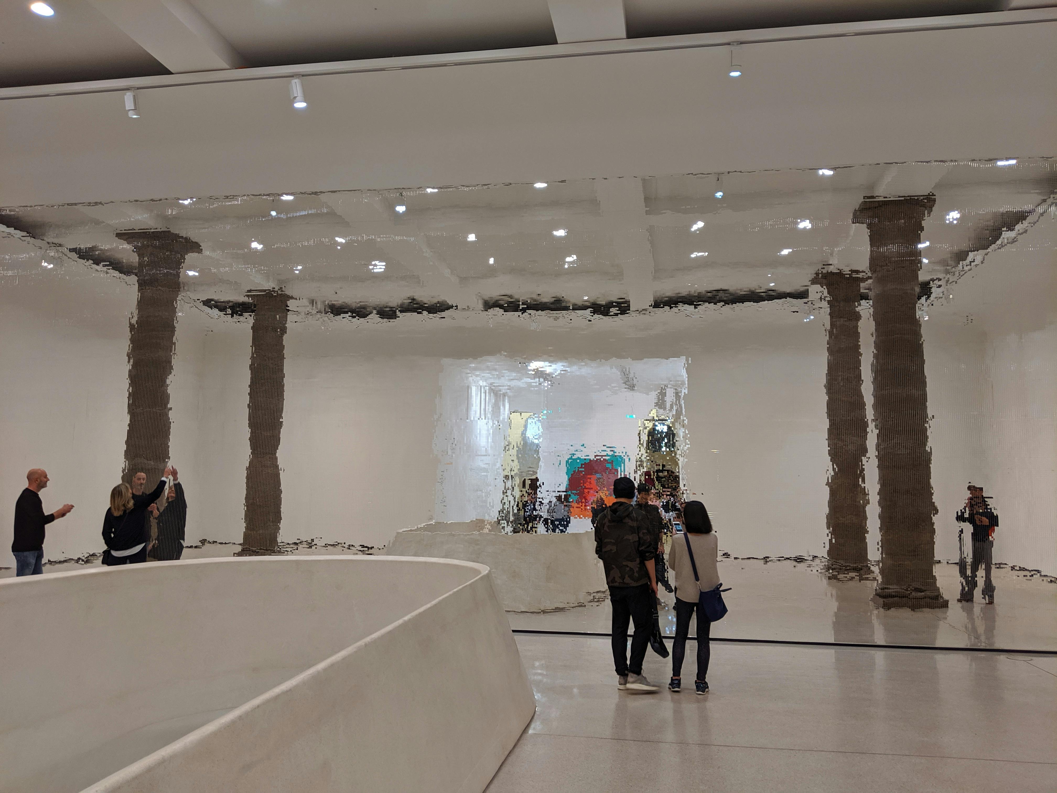
Infrastructureâs Involuntary Confessions
Not all of the cityâs color speech is on purpose. A lot of it is the unconscious muttering of the infrastructure itself. The burnt orange of a rusted I-beam sweating under an overpass. The teal-green mineral stain from a leaky copper pipe bleeding down a concrete wall. The sickly chartreuse patina on a forgotten bronze statue. These are the cityâs involuntary confessions. Theyâre the colors of time, chemistry, and decay, and they tell a truth no civic branding campaign can touch. This is the city admitting its age, its materiality, its slow, entropic slide back into the earth.
Utility companies are some of the cityâs most prolific, if unwitting, poets. Their color-coding is a pragmatic, life-or-death syntax sprayed right onto the asphalt. Red for electric, yellow for gas, orange for comms, blue for water, green for sewer. A freshly painted intersection, crisscrossed with these lines, is a medical chart of the cityâs guts, laid bare before the asphalt skin is grafted back on. Itâs a fleeting, highly technical message meant for a crew with a backhoe, but for anyone who knows the code, itâs a moment of pure urban legibility. You see the hidden arteries that keep the whole messy organism alive.
Silencing the Cityâs Voice
If color is a language, then the global plague of âgreigeââthat non-committal beige-gray hybridâis a form of aphasia. Itâs the silencing of a cityâs voice, one luxury development at a time. From Lima to Los Angeles, these buildings speak the same muted dialect. Itâs a color designed to offend no one, to signify a generic, placeless modernity. Itâs the visual equivalent of airport lounge music. This chromatic gentrification doesnât just paint over old walls; it paints over history, over local identity, over the very possibility of a building having something specific to say. A greige box tells you nothing about where you are. It could be anywhere, and thatâs the whole point. Itâs the language of capital trying to erase geography itself.
But the erasure is never total. The streetâs language is tough. A splash of betel nut juice on a greige wall in Mumbai. A bright, desperate flyer for a lost dog taped to a greige lamp post in Brooklyn. A patch of electric-green moss colonizing a greige planter in London. These are the city talking back. They are the unplanned, the organic, the human-scale interruptions that crack the monolithic facade. They are the stutters and exclamations that prove the city is still a living, breathing thing, not a sterile rendering.

Learning to Listen with Your Eyes
To see color as a language is to switch from being a passive consumer of the urban spectacle to an active listener. Itâs a shift in perception. That garish pink house on the corner isnât an aesthetic mistake; itâs a statement of individuality, a cheerful middle finger to conformity. The sudden spread of a specific shade of blue on the shutters of shops in one district might signal a political allegiance, a corporate sponsorship, or a local superstition about warding off evil spirits. The meaning isnât locked inside the color itself. It lives in the relationship between that color and everything around it. Itâs a relational, contextual language.
This kind of literacy is a form of deep citizenship. It lets you read the tensions, the histories, and the aspirations baked into the walls around you. You start to see the city not as a static backdrop but as a dynamic, argumentative text. A new coat of paint is a new paragraph. A faded sign is a memory. A graffiti piece is a passionate, often anonymous, op-ed. The city is constantly writing itself, and color is its most immediate, gut-level vocabulary. You just have to learn the words.
Frequently Asked Questions
How can I start to âreadâ the color language of my own city?
Start with a single block. Walk it slowly and ask yourself not âDo I like this color?â but âWhat is this color doing here?â Is it pulling you in, warning you off, hiding something, or celebrating? Look for repetition and contrast. A color that appears only once is a whisper; a color that appears on every fire hydrant is an institutional command. Pay attention to the edgesâwhere one color butts up against another. That border is often where the most interesting dialogue happens, between a business and a neighbor, between a tagger and a property owner, between nature and concrete.
Is the language of color universal, or does it change from city to city?
Itâs a language with a thousand local dialects. A bright yellow might mean a taxi in New York, a color of mourning in parts of Southeast Asia, and a political party in Brazil. The basic human response to color saturation and contrast might be hardwired, but the specific meanings are cultural and hyper-local. A true reading requires you to understand the local context, history, and material conditions. The color of the local stone or brick often becomes the cityâs native accent, the base tone against which all other color statements are made.
What happens when a cityâs color language is overly controlled by regulations?
You get a visual monoculture. Historic districts with strict color palettes can preserve a certain charm, but they can also become frozen in time, more like a museum than a living place. Over-regulation kills the vernacular, the spontaneous, the improvised. It turns a language into a script. The most electric urban color languages are often those that exist in a tense, creative friction with official rulesâwhere people paint their homes the colors of their dreams, not the colors of a heritage committeeâs approved swatch book. A city without chromatic friction is a city that has stopped talking.